


What Is Included in a Color Analysis Session?
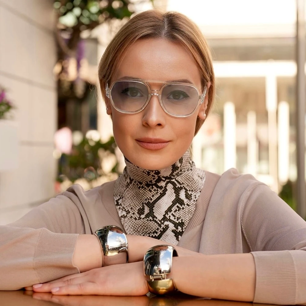
Color analysis is one of the tools I use to make wardrobe decisions more precise. It helps determine which colors work best with your natural coloring and how those colors can be applied to clothing, makeup, accessories, and hair.
During a session, I look at your skin tone and undertone, natural hair color, eye color, and the level of contrast between your features. I also assess how your appearance responds to warm and cool shades, lighter and deeper colors, and bright versus muted tones.
The main part of the session is color draping. Different fabric colors are placed close to the face and compared directly. This allows me to see how each shade affects the complexion.
I look at whether the skin appears clearer or more uneven, whether shadows under the eyes become stronger, whether redness becomes more noticeable, and whether the eyes and facial features gain definition. Sometimes two colors may look very similar on a hanger but produce a completely different effect when placed next to the face.
We may compare warm and cool reds, cream and optic white, camel and taupe, dusty pink and fuchsia, olive and emerald. Comparing colors side by side is usually much more informative than judging one shade on its own.
Undertone is part of the analysis, but it is only one factor. Many people are relatively neutral and can wear both warmer and cooler shades within a certain range. For them, depth or saturation may have a stronger influence than temperature.
We also determine how light or dark your strongest colors should be. Some people look particularly good in lighter and medium shades. Others need deeper colors around the face to create enough definition.
Color intensity matters as well. A client with clear, high-contrast coloring may handle saturated shades such as cobalt, emerald, bright red, or strong pink very well. Someone with softer coloring may look better in more complex shades such as dusty rose, muted teal, sage, smoky blue, or softened burgundy.
A useful color analysis also needs to address neutrals because these usually make up a large part of a wardrobe. I compare black, navy, charcoal, gray, chocolate, camel, taupe, ivory, cream, and different whites. Black is often treated as a universal neutral, but it is not always the most flattering color around the face. For some clients, deep navy, espresso, charcoal, or another softer dark neutral works much better.
We also identify your strongest accent colors. These are useful for dresses, tops, jackets, scarves, jewelry, and pieces where color has a stronger visual presence. For eveningwear in particular, knowing your strongest reds, blues, greens, pinks, or jewel tones makes shopping much easier. Instead of choosing only by silhouette, we can also control how the color interacts with the face.
Makeup, Hair, and Jewelry
I also connect the color analysis to makeup.
We discuss suitable directions for lipstick, blush, eyeshadow, and eyeliner. In some cases, the main difference is temperature. In others, depth is more important. A pale nude lipstick, for example, may remove too much definition from the face, while a deeper rose, berry, brick, or red creates a much stronger result.
If the client colors her hair or is considering a change, I also look at hair color direction. This may include warmer or cooler browns, blonde tones, copper shades, deeper brunette colors, or simply adjusting how light or dark the hair should be.
Hair has a large visual presence around the face, so it directly affects how clothing colors work.
Jewelry is considered as part of the same system. We look at how yellow gold, silver, white gold, rose gold, bronze, and mixed metals interact with the skin. This is particularly relevant for earrings, necklaces, glasses, and other pieces worn close to the face.
At the end of the session, I translate the analysis into a practical color palette.
I prefer to give clients a usable range rather than a very narrow set of “approved” colors. The purpose of the palette is to help with real shopping and wardrobe decisions.
You may have certain colors that are especially strong close to your face, while other shades can still work perfectly well for trousers, skirts, shoes, bags, or smaller accessories.
I also consider the client’s actual lifestyle and style direction.
A technically flattering color is not automatically the right choice for every wardrobe. The way I use the palette depends on your work environment, preferred style, level of contrast, wardrobe habits, and the image you want to create.
For one client, we may focus on sophisticated neutrals for a professional wardrobe. For another, the priority may be stronger fashion colors, eveningwear, makeup, or a complete image change.
The color analysis provides a visual framework that can be applied to the rest of the styling process.
After the session, you should understand which neutrals work best for you, which colors are strongest close to your face, how much contrast and saturation suit you, which metals are most flattering, and which makeup and hair-color directions make sense for your natural coloring.
The practical benefit is simple. Shopping becomes faster, and it becomes easier to understand why one version of a color works beautifully while another very similar shade does not.
Over time, this also makes the wardrobe easier to coordinate because the colors you buy begin to work together much more naturally.
If you want to understand which colors genuinely work for your skin tone, wardrobe, makeup, and hair, you can book a personal color analysis session with me in Houston. We will build a practical palette around your natural coloring and show you how to use it in everyday outfits, shopping, occasionwear, and beauty choices.
Comments